HOUSE AND LOT DESIGN
Factors which distinguish good design from poor design are somewhat subjective and vary from buyer to buyer, from builder to builder, and from architect to architect. There are certain qualities of good design that most can agree upon. These include a sense of comfort and good taste in the combination of materials, spaces, and equipment so that a feeling of inner satisfaction comes to the occupants of the home.
Good design and affordability are not incompatible. In fact, poor design at any price is difficult to market. The JVAH program proved that well-
designed small "affordable" homes actually enhance the neighborhood and add to property values.
Smaller lots present more of a challenge for placement of homes than do larger, more forgiving lots. Space for parking, utility locations, drainage, and driveway lengths are more critical. Privacy, topography, view, and natural growth are important factors in house placement. If natural features are absent, manmade features such as stormwater retention ponds, parks, and landscaping offer opportunities for interesting placement of homes to provide visual variety.
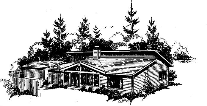
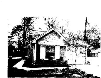
For smaller homes, it becomes more important to orient central living areas to outdoor spaces or views. Single-story homes preserve privacy because they do not look out over fences and more rooms can be placed around patio space.
Second story windows should be oriented away from neighbor’s yards and toward natural views whenever possible. By promoting outdoor living with decks, patios, porches, and garden seats, small homes become much more attractive and lose the small feeling.
A well-designed floor plan will consider the functions of different areas of the house; i. e., sleeping, living, working, dining and circulation spaces and their relationships to each other.
By orienting major living areas to the south, you can take advantage of the winter sun and provide a measure of passive solar heating. Likewise, by placing storage space and seldom used windowless rooms on the north elevation, heat loss to the sunless side of the house will be minimized. These techniques will, of course, be more important in certain climates than others.
Where heating is of little consequence, orientation is not as important.
Where heating and cooling are both
important, shading of south facing windows in the summer becomes very important.
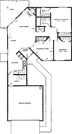 Minimize the distance between parking and the kitchen. This not only provides relief from carrying heavy shopping bags, but also reduces tracking in dirt across carpeted areas. An entrance from parking through a work zone such as a laundry room provides an area for muddy shoes and heavy outer garments.
Circulation area is, in effect, wasted for most other uses. The exception might be a pass-through work area. Otherwise, small homes cannot afford the luxury of space that is intended solely to travel from one area to another. Good design will hold such space to the absolute minimum without undue traffic through living areas. Placement of entry doors and closets will dictate traffic patterns.
Small homes often seem more spacious by careful use of sight distances.
That is, when in a closed-in room, it does not matter whether the house contains 1,000 or 2,000 square feet. Perception of size ends at the walls. Therefore, eliminate interior walls and provide angles where the occupant can look through other spaces, preferably to the outdoors through a large window or sliding glass door.
However, looking through a work space is not normally considered desirable.
|
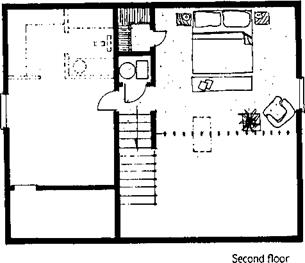
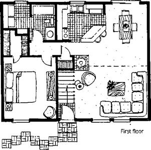 Several of the small JVAH homes used vaulted ceilings and clerestory windows to provide a feeling of open space. Loft space with a balcony not only provides real space but also the illusion of much more space in small homes. Lofts are also perceived as luxury features even though they are no more costly to build than closed-in space. Open riser stairs to lofts reduce visual blockage and create an "open" feeling.
There are some basic architectural rules that have been proven successful and marketable for small homes. One major rule is do not simply take a large house plan and scale it down. This does nothing but accentuate the smallness.
The number of small families, singles, and empty-nesters is growing rapidly. Most of these are not interested in unusable space. They are more interested in good design and ■ amenities.
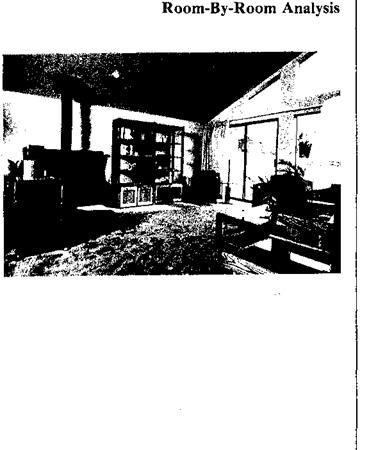
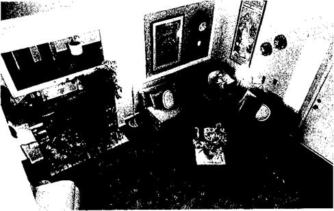
Good plans are made up through room – by-room analyses. How can you tell a good room from a bad one? Before a room can qualify as being well planned, it must pass two tests:
1. Does circulation work inside the room?
2. Is there a place to put furniture and arrange it properly after circulation and stairs are taken care of?
Possibly the most important room is the living area, but it is not necessarily the most difficult room to plan. Kitchens, laundries, bedrooms, bathrooms, family rooms, and storage areas all present planning problems.
The good living room is free from through traffic and designed for best furniture arrangement. It will be designed for both interior views (T. V., fireplace, feature areas) and exterior views. In a good layout, furniture doesn’t have to be moved every time
you wish to look at your favorite T. V. program, watch the fire, or look out the window.
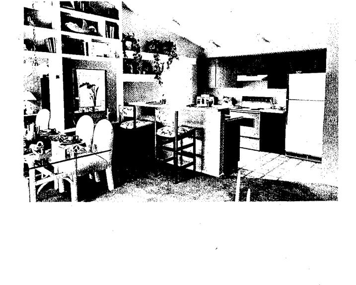
A good kitchen is not necessarily "glamorous" or "gadgety," although some glamour or gadgets may be marketable. Primarily, a good design is one that works. Is it laid out efficiently? Does it have the right kind of storage in the right places and in the right amounts? Does it make the user feel like a prisoner or does it make the time spent relatively pleasant? Is it located properly in
relation to the rest of the plan?
Above all, is the kitchen the control area for the rest of the house?
Modern laundries are designed to save precious small home space. But this does not mean laundries should be crammed into a left-over corner. The laundry-utility core should be located near the kitchen or a bathroom. Garages or basements are alternative locations although they have drawbacks. Arrahge laundry appliances logically with good outside light if possible.
Bedroom space in small homes is often too small. Don’t throw away space in excessive hallways. Large windows make the bedroom look bigger and provide plenty of light and ventilation. Master bedrooms should contain adequate space for at least queen-size or twin beds.
attic storage with pull-down stairs may be feasible. The most important things to remember about storage are:
1. There is never enough of it.
2. It should be located according to. frequency of use.
The argument for small windows because of privacy considerations is not valid since curtains or drapes are pulled over even the smallest windows. A good bedroom will have unobstructed closet space. Other live storage, where circulation is likely to occur throughout the day, should be placed elsewhere in the house.
Bathrooms, especially in small one-bath and bath-and-a-half homes, should be able to accommodate more than one person at a time with privacy provided for the toilet. They should provide plenty of storage for all the items that functionally belong there. Generous mirror surfaces make the bathroom seem larger. If space is available, a master bath/dressing area off the master bedroom is a desirable feature.
Storage areas often are overlooked in small homes. These areas are even more critical in smaller homes than large ones, where a spare bedroom can double as storage. Small homes on small lots have almost the same storage requirements as large homes. Depending on roof structural design,
It should be designed, dimensioned, and subdivided accurately for articles to be stored, not just vaguely tossed into a plan as a "closet" or "shelf.
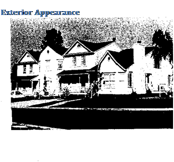 Design does not end with a good floor plan. The exterior style and combinations of shape and mass are equally important. Pleasing visual proportions and textures are not limited to larger, luxury homes. Uncluttered, simple appearances can be pleasing in small, less expensive homes too.

In fact, simplicity and restraint in exterior appearance tends to be acceptable to more buyers than expensive scrollwork, bric-a-brac, and gingerbread which often leads to architectural chaos. This is especially true in small homes where one can be deluged with too much "style" in a short visual scan. In other words, it is often better to simplify and spend less on exterior appearance for better design.
Horizontal and vertical elements of the entry facade need to be balanced and well-proportioned for visual continuity. Selection of exterior surface materials should be made with the market in mind.
Do not ignore what has been successful in the community, but also do not arbitrarily assume that certain sidings and styles will not work. Builders are traditionally much more conservative than the home buying public. This is understandable when one considers the risk involved in doing something different. An award winning design is useless if it does not sell. But pent-up demand for different styles of homes often goes untapped because of too much conservatism.
In the JVAH, Santa Fe builder Mike Chapman risked putting a contemporary, plywood-sided, sloped-roof house on the market in an adobe/stucco, flat-roofed, Spanish architecture community. He was of the opinion that the only reason this style home was not "marketable" was that it had not been built. He conducted a marketing survey that indicated there was, indeed, a pent-up market. The 47-unit first phase sold out in two weeks. The entire 154-unit subdivision sold out one year ahead of schedule. Chapman paid a lot of attention to both interior and exterior design.
Good design rules are not carved in stone for all houses and communities. A California contemporary design might not sell on Cape Cod. A Cape Cod cottage might be out of place m Arizona. But an astute builder will take advantage of a market that all others ignore because of "tradition."
Basically, however, there are some rules that transcend local preferences.
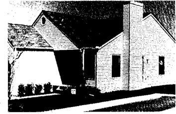 For the roof, provide a strong fascia on overhangs. Depth and style of overhangs should complement the overall appearance. A cascade of roofs at the same slope can be visually pleasing if not overdone.
Normal transitions, say from the house to the garage, are the best places to change roof lines. Roof overhang changes for a porch or sun shading of windows also create a visual break. Remember, however, each change in roof lines adds to costs.
The home entry should be clearly recognizable at first glance. Full – height windows and sliding glass doors on the front of the house need to be easily distinguished from the primary entry. This can be done by creating a transition space to the front entry by using paths, steps, or landscaping.
Once inside, there should be an entrance "space" that clearly defines the area. A separate vestibule or entrance room is not necessary, but the area needs to be defined by a change in floor surface, railings, closets, etc. Ideally, entrance "control" should be maintained from the kitchen. That is, the primary entry should be visible from the primary work area – the kitchen.
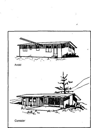
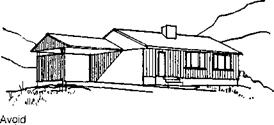 Since the garage is often the main entrance for much of the family, it can be designed as a positive entry rather than just a passage door to the garage.
Keep window and door heads in line. Wall thickenings add interest (but also add cost), as do front entry setbacks. Carefully select windows to fit overall design and locate them for best natural ventilation and for architectural balance,
The rear elevation is often the "forgotten" elevation. Because much time is often spent in the back yard and because the rear elevation is often viewed by the neighbors or from another street, care should be taken to make it attractive also.
For small homes, it is difficult to maintain good width/height balance.
If the house sits on a high foundation, proportions often are not the best and the house looks "boxy" and even smaller. A lower profile elevation tends to make the house appear larger. The building to ground connection can be softened by landscaping, steps, terracing, etc. This tends to reduce the high boxy look.
|
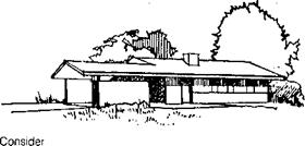
 Within the framework of good marketable design, there are methods to ensure that costs are lowered without sacrificing marketability.
First, use modular dimensioning. Most building materials are produced in increments of 2 feet, including trim, lumber, sheathing, and some sidings. The most efficient use of these materials will be obtained if overall house dimensions are laid out on a 2-foot grid. The, most efficient plan is a basic rectangle which allows simple floor and roof structures on the 2-foot grid.
For design variation, two offset rectangles provide a break in roof lines as well as an elevation change. An offset garage also can be used to break up the flat front look. Keep in mind, however, that each variation from the basic rectangle adds cost. Depth of the most cost effective rectangle is limited by the allowable span of roof and/or floor framing members.
House shape and configuration effect total cost for the same amount of floor space. For example, an "H" shaped plan has 46 more linear feet of wall, 8 more corners, 4 more roofing areas, 2 more gable ends, and 4 more valleys than a rectangular plan.
The most cost-effective plan is one that encloses the desired floor area
|
Unit Plan Shape (1,200 $q. ft. average area) |
Exterior Walls |
Roof System |
||||||
|
Lin. |
Comers |
Roofing |
Gable |
Hip |
||||
|
Ft. |
Out |
In |
Areas |
Ends |
Valleys |
Hips |
Valleys |
|
|
I I Square Plan |
140 |
4 |
– |
2 |
2 |
– |
4 |
– |
|
I I Rectanaular Plan |
142 |
4 |
– |
2 |
2 |
– |
4 |
– |
|
* I ‘ I Offset Rectanaular Plan |
156 |
6 |
2 |
4 |
3-4 |
– |
NA |
NA |
|
Q=3 “L" Plan |
152 |
5 |
1m |
4 |
3 |
2 |
5 |
1 |
|
Ш "U” Plan |
172 |
6 |
2 |
6 |
4 |
4 |
6 |
2 |
|
И "H" Plan |
188 |
8 |
4 |
6 |
4 |
4 |
8 |
4 |
with the least amount of exterior wall. The, ratio of floor to wall should be as high as possible within design parameters. For example, a 28×40 plan has 1,120 square feet of floor area and 136 linear feet of wall for a floor/wall ratio of 8.24. A 24×46 has 1,104 square feet of floor area and 140 linear feet of wall, a ratio of 7.89. The 28×40 plan is more efficient.
The high floor-to-exterior-wall ratio approach can also apply to the interior partitions. That is, the "open planning" concept of space limits the total length of interior partitions. As mentioned earlier, this is also a technique to make a small house seem bigger inside.
Defining areas by floor textures, railings, ceiling height changes, etc., eliminates the need for some interior partitions. It also results in lower costs for framing, drywall, painting, and, very importantly, for electrical wiring.
Plans that provide for future expansion may be desirable in some markets. If done, give special attention to problems of access, circulation, and plumbing and heating extensions. It can be a useful marketing tool, especially to first time home buyers with small families.
Future usable space within the exterior shell was provided in the Santa Fe, Lincoln, Tulsa, and Baltimore County JVAH demonstrations.
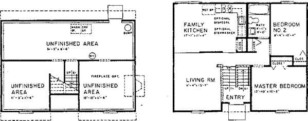 |
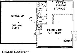
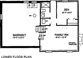
Slab-on-grade designs minimize cost and foundation problems in many areas of the country. If basements are perceived necessary because of marketing or site considerations, use multi-level designs which increase habitable space at minimal cost.
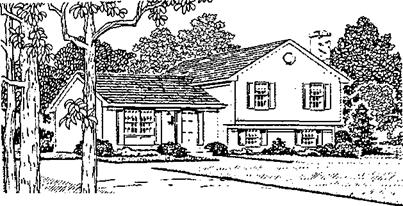
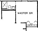
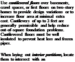 If the foundation type is optional, remember that it is almost always less expensive and more desirable to add habitable space above ground than below ground.
|
exterior wall stud (on the 2-foot grid). This provides a tie-in without extra framing or blocking and provides one side of drywall backup.
At least one side of window or door framing can coincide with normal modular framing in almost every case. It may be necessary to move the rough opening a few inches in one direction or the other to save a stud or two and, in most cases, the architectural balance will not be affected enough for anyone to notice.
If trusses are used, gable end walls are essentially nonbearing. Because of this, structural headers over openings are not necessary. Therefore, locate large openings in the gable ends if consistent with exterior design and floor plan.
Likewise, interior partitions are usually nonbearing. Openings do not require structural headers. If a load-bearing interior wall is necessary, limit the number of openings in that wall.
Most major model codes allow a 7’6" ceiling height. For small homes, this height may provide a better exterior scale. It also reduces siding and may eliminate one step from stairs in a two-story home. However, extra costs can be expected on drywall application. Studs must be trimmed unless they can be purchased precut for 7’6" ceiling heights.
When possible, plan for straight-run stairs, parallel to floor framing members, and coordinate the stairs with normal joist positions on one side to reduce floor joist disruptions.
As shown in the framing section, stair trimmers and headers can be reduced if properly laid out.
Attic/crawl space access doors should be located between framing members to eliminate structural headers. If framing members are spaced 24 inches on center, ample access space is provided.
Consider centralized ‘back-to-back" plumbing around a common stack to minimize piping requirements. In two-story homes, arrange upper level over lower level plumbing connected to the same stack. It will be necessary, no doubt, to point out these features to the plumbing contractor in order to get a reduced bid from him. Also lay out plumbing to minimize disruptions to structural members. Concentrate as much plumbing as possible in the same wall.
Plan chases for ducts and flues to allow ample clearances and to avoid disruption or displacement of structural members. Too often, duct placement is an afterthought which requires expensive solutions.
When practical, locate heating/cooling equipment in a central location to reduce duct runs and sizes and to provide good distribution. For small houses, a centralized system often means duct runs of less than 10 feet if high inside wall or ceiling registers are used. However, be sure to follow manufacturers’ recommendations concerning placement because some equipment is designed specifically for outside wall locations.
Develop complete working drawings and specifications covering all important details for the construction process. Where possible, concentrate details for specific trades on a single drawing. Avoid tight or highly critical dimensions where possible (such as cabinets between walls). If such
 |
critical dimensions are necessary, show in bold lettering, by underlining, or by some other method that leaves no doubt that these dimensions must be accurate.
All design recommendations apply equally to site-built, factory-built (modular and HUD code), and com – ponentized housing. Most JVAH demonstration sites consisted of site – built homes, but modular units were used in Springfield, MA; Orange, NJ;
and Elkhart, IN. HUD code-manufactured units were used in Oklahoma City, Stevenville, TX, and Elkhart. Panelized units were erected in Sioux Falls, SD, and White Marsh, MD.
The first step toward cost-effective construction is efficient design. Many costly details can be corrected in the design process. Therefore, the importance of merging good design for marketability and efficient design for construction cannot be overemphasized.
Builders in the affordable housing demonstration were not given specific designs to build. Rather, they were asked to design homes they thought would be marketable in their areas, and to submit these designs to HUD and NAHB/NRC for evaluation and suggested cost-saving revisions.
 Since the builders were not subsidized, they could accept or reject suggestions. Most were very successful in offering high-quality, well-designed homes at affordable prices.
![]()
![]()
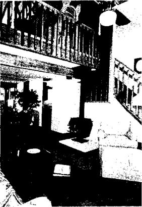
Mike and Walton Chapman were exceptionally daring, building homes that, for Santa Fe, were unconventional for the market. Floor plans were simple and uncluttered. Vaulted ceilings with lofts gave a feeling of spaciousness.
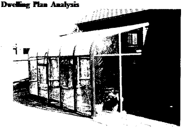
They also offered expandable, do-it- yourself space, but most buyers opted for the builder to finish the space. Living rooms and dining areas were contiguous, which allowed 24-foot unobstructed front-to-rear visual continuity. Sliding glass doors were located to further increase the line-of-sight. Houses were located on the lot in a "pinwheel" configuration. Garages were attached at the lot-line. Solar greenhouses were offered as options.
 The JVAH site was a mixture of townhouses, quadplex, zero-lot-line, and pinwheel cluster cottages. Density was eight units per acre.
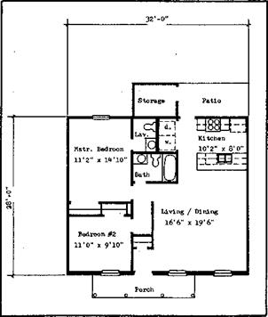
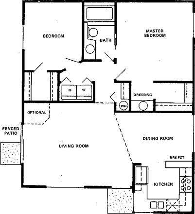
The cottages contained two bedrooms and one bath in 880 square feet.
John Phillips, the builder/developer, had previously built another subdivision of these small, inexpensive homes and received national attention in Professional Builder magazine as an award-winning project.
Sixty-four of the 176 units were these cottages. They were basically square in design, giving the best floor area to exterior wall ratio. A small 4-foot offset provided a break in the front elevation and also allowed a break in the roof lines.
The floor plan was very functional with minimal circulation area. The living/dining areas were combined into
a "great room" of approximately 360 square feet. A vaulted ceiling over the 14×18 living room area added to the feeling of spaciousness.
A sliding glass door off the living area leading to a small fenced-in yard also helped in making a small home seem very large. A window off the kitchen area facing the front door provided entrance control.
Although it contained only one bath, Phillips provided a second lavatory in a dressing room off the large master bedroom walk-in closet. The bathroom featured a skylight, cultured marble shower surround, and a "step-up" bathtub which added a sense of luxury at minimal extra cost.
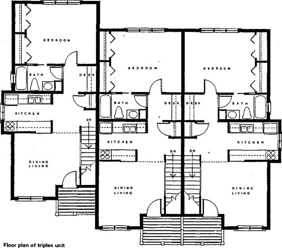
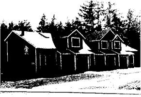
The one-bedroom "loft" home quadplex units were designed for singles, newlyweds, and others who needed minimal space. They were arranged in a back-to-back configuration, each with its own private entrance and small yard.
The zero-lot-line homes contained two bedrooms and one bath with a small loft overlooking the living area.
Each featured a two-car garage.
Floor plans were more traditional than other styles within the project, but the loft added interest and the vaulted ceilings created space.
 |
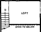 |
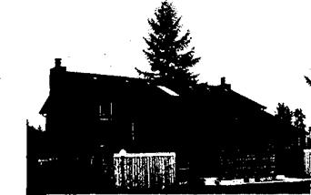
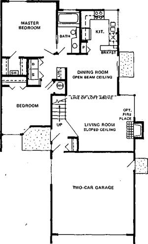 The smallest loft home contained 648 square feet and the largest, 674 square feet. The main level consisted of a living room with a vaulted ceiling, a dining area with vaulted-open beam ceiling and a kitchen. The upper loft area contained one bedroom and a bath.
The bedroom was open to the living area below, separated by a 4-foot high wall. This provided, in effect, one large open area for all rooms in the unit. The only full height interior partitions were for the bathroom and closets.
The living room/dining room/ kitchen combination created a large front-to – rear "great room." Interior partitions were minimized by this open approach.
![]()
 |
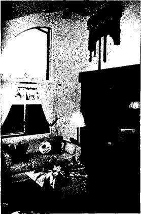
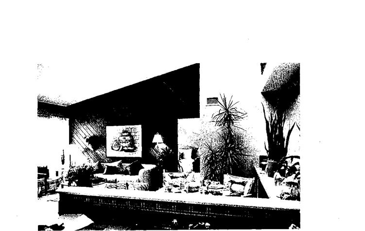
The townhouses were also designed with openness in mind. Living rooms leading into dining areas and vaulted ceilings with lofts made the small two-bedroom units seem much larger.
Knoell Homes designed the house plans with the goal of making the small units attractive and saleable while paying attention to production efficiencies.
Innovative use of interior space, such as vaulted ceilings and living areas opening onto outdoor patios, created a sense of openness.
Three models of townhouses and three basic models of zero-lot-line detached homes ranged in size from 770 to 1,295 square feet. The largest detached home had alternative floor – darts providing either two or three
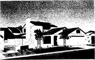
 The builder did an outstanding job of combining design with production efficiencies by designing major outside dimensions in multiples of 4 feet and minor dimensions in multiples of 2 feet. Since most construction materials come in increments of 2 feet, there was very little scrap and labor time for cutting, and fitting was reduced.
The JVAH project consisted of 50 townhouse units on 2.87 acres, or 17.4 units per acre. Two models, a one bedroom and a two master-bedroom, were built.
The market was determined to be first time buyers, including singles and newly marrieds. The one-bedroom unit contained 896 square feet. The lower level consisted of a large living/ dining great room and the kitchen.
The upper level contained one large bedroom and a large bathroom/laundry.
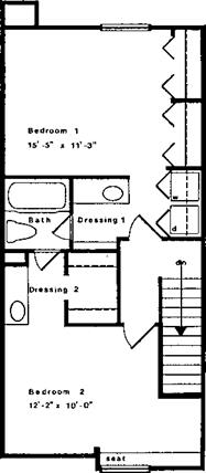
The two-bedroom unit contained 1,088 square feet. The lower level contained a 15 1/2×18 great room, kitchen, and powder room. The upper level contained two bedrooms, a single bathroom and separate vanities for each bedroom.
|
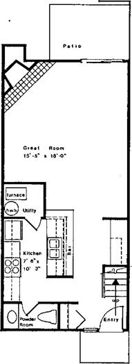


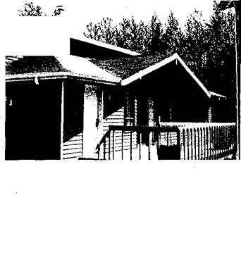
 The Everett JVAH site, Sunridge, consisted of 81 units on 12.2 buildable acres. Three basic zero-lot-line detached models were built, ranging in size from 1,076 to 1,624 square feet. Sunridge homes were designed to make the units energy efficient, attractive, marketable, and affordable.
The builder, Rich Boyden, was especially attentive to details that appealed to his target market, including interesting angles, privacy, and an abundance of light.
All units were designed with the bulk of the glazing facing south for maximum passive solar gain. Clerestory windows and other large areas of glass made the homes very energy efficient. In addition, Boyden installed small wood burning stoves in all units which proved to be a very desirable feature. Interviews with occupants indicated that, during the winter of 1985-86, total heating costs were between $15 and $50 per month, depending on the use of the wood burning stove. The south-facing windows are shaded in the summer.
Rex Rogers determined that there was a market for very small (504 square feet to 960 square feet) homes on small lots. Rogers believed basic, no-frills housing would sell in his area.
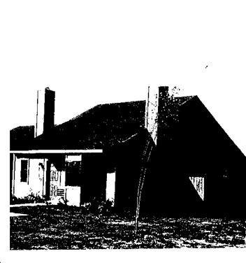
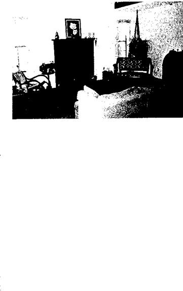 Four models were offered: a 504- square-foot efficiency unit, a 638- square-foot two-bedroom unit, a 782- square-foot three-bedroom unit, and a 960-square-foot three-bedroom unit. The efficiency unit, which was nothing more than one large room with an accordion wall separating the bedroom area did not sell. However, the other units sold well.
A popular option was a loft which added from 384 to 528 square feet. The homes sold from about $27,000 to about $35,000 without the loft or garages.
Although the units were small and basic in design, they were built with quality materials and workmanship. Exterior walls were built with 2×6 framing, 24 inches on-center, and contained R-19 insulation.
The floor plans have proven to be marketable in other areas of Arkansas. Through the efforts of HUD Area Office Manager, John Suskie, the JVAH program has become extremely successful in the region.


Leave a reply