RYNERSON HOUSE
The renovators: Juanita and Steve Rynerson had lived in the original house 14 years while raising two sons. According to Juanita, a teacher, and Steve, an architect, "we no sooner had an empty nest than we demolished it.” To make an ambitious renovation affordable, they house-sat various houses for a year, which required that they move from house to house, while working full-time jobs and overseeing the renovation.
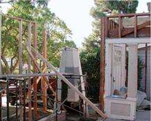
The house: This two-bedroom Craftsman cottage was built in 1915. In the mid-1960s, according to Steve, "the previous owners stuck their heads in the attic and said, ‘Oh, we can put two more bedrooms up here.’ ”
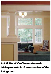
What worked: Great schools, nice neighborhood, large pleasant backyard. Being an old-house person, Steve loved the architectural elements that had evolved over a long time and gave the house integrity—the formal dining and living rooms toward the front of the house, the wide trim and high ceilings, the graceful overhangs.
What didn’t work: From the start, Juanita found the house dark and depressing. Both agreed that, given the scant light, poor traffic
flow on the first floor, and serious structural problems on the second, only major remodeling would set things right. Together, they created a detailed list of the cottage’s shortcomings (see the drawings on p. 26).
► The layout along the back of the house was "a mess," with four rooms—a small bedroom, a laundry, a kitchen, and a bathroom with a shower and tub—crammed into the building’s 30-ft. width. The kitchen was little more than a closet with a water heater.
► The house was uninsulated, with a single floor-furnace for heat.
► The second floor was not worth saving.
The rafters were skimpy 2x4s, spaced a too-wide 32 in. on center, with 3 ft. 6 in. overhangs—"more like a tent than a roof," Steve noted. The original attic floor joists were 2x4s, and when the previous owners converted the attic into bedrooms, the increased loads sagged the ceiling (and floor) of the dining room below.
Constraints: To avoid the hassle and delay of seeking a zoning variance (or knocking down the house and starting over) the Rynersons decided not to increase the existing house footprint. Also, they didn’t want to encroach on the backyard.
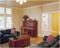
![]() A view from the living room, looking southeast, shows how extensive the renovation was. At right are the original front door and entry trim.
A view from the living room, looking southeast, shows how extensive the renovation was. At right are the original front door and entry trim.
After renovation: Although the remodeling raised the ridge 6V2 ft. and added 750 sq. ft. of living space, from the street, the house looks smaller than it is.
Before renovation:This two-bedroom Craftsman cottage was built in 1915.

![]()
And they wanted the new design to respect the scale of the houses around it.
The plan: Build up. Add a second story, but maintain the intimate cottage feeling. (One of their interior designers referred to the new design as "a Craftsman on steroids.”) Improve first-floor traffic flow, move the master bedroom upstairs so it will have more natural light and long views, upgrade and add bathrooms, and tie the house to the backyard.
Compromises: Steve noted, "Renovation is kind of a slippery slope, so we ended up replacing more of the house than we anticipated. A lot of it was structural stuff we had to do. So the project took longer and cost more. You deal with it.”
Surprises: House-sitting was an adventure. A year of living simply—living on houses rather than in them—forever changed the way the Rynersons live. Their renovated house is spare and uncluttered. Combining the roles of architect/ client and husband/wife was also a challenge, but the constant communication required by the remodel brought them closer and reminded them, over and over, of the traits they cherished in each other.
|
|
|
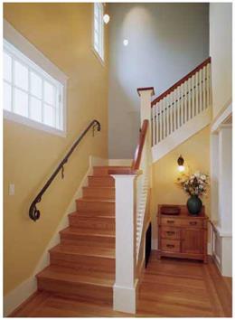
Once you enter the front door, the space opens dramatically as the stairwell soars two stories. As Craftsman-inspired as the renovation is, this entry leaves historicity behind. The squiggly railing, the floating ceiling fixtures, and the wall colors are light-hearted and new. |
All in all: The workmanship is exquisite, relying more on the subtle beauty of natural materials than on fancy edges or shiny finishes. Simple shapes; honest forms. In one bathroom, as shown on p. 323, we see fine-grained black granite counters, luminous cherry cabinets, and nautilusshaped fossils swimming in limestone that was a seabed in Jurassic times.
Shared thoughts: Juanita mused: "The painter ran late, and the house reeked of fresh paint the day we were to move back in. Sometimes, you just have to let things go. So we pitched a tent under the redwood in the backyard, ran an extension cord to the house so we could watch TV, and camped out for a few days. It was good to be home.”
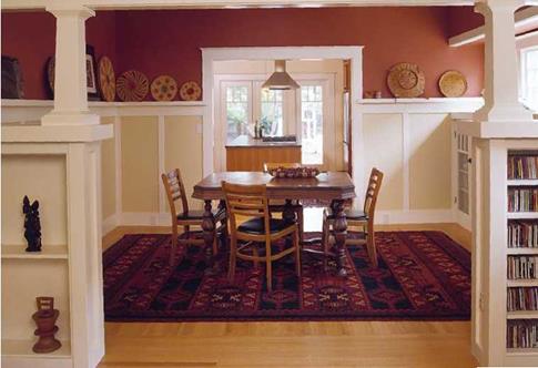
The new floor plan improved traffic circulation dramatically. Beyond the dining room, a gourmet kitchen opens to a lush backyard.


Leave a reply